Sales Ninja Academy
A sales training platform with AI practice calls, in Arabic and English
Sales Ninja Academy is a digital platform for training and developing sales teams. It combines practical training with AI-powered simulation, helping individuals and companies build selling skills, measure performance and prepare for real sales situations.
- Client
- Sales Ninja Academy
- Industry
- Sales training and EdTech
- Project type
- Training platform and website
- Our role
- UX/UI design and full development
- Duration
- Three months

The goal
To build a digital presence that shows Sales Ninja as a modern sales training platform, and to turn a traditional presentation of training services into an interactive experience that explains the value of practical training and AI simulation. The site also had to make the methodology and training tracks easy to understand, build trust in the academy and guide individuals and companies towards starting training or contacting the team.
The challenge
Sales Ninja offers more than courses: practical training, AI-powered simulation, several tracks, performance measurement and solutions for both individuals and companies. All of this, along with the methodology, courses and pricing, had to be explained quickly, without asking users to read large amounts of content and without the site feeling like a crowded, conventional training website. The experience also had to separate introducing the brand, building trust, explaining the methodology, exploring the training and deciding to subscribe or get in touch, while balancing a bold brand personality with the clarity a training or business decision needs.
The solution
We designed the experience as a decision journey. It starts with the value of Sales Ninja, builds trust through experience and partners, explains the methodology and tracks, then moves to courses, client reviews, the team, packages and frequently asked questions. Visually, we developed a bold, modern language that brings together the ninja identity, the brand colours, interactive elements and motion without affecting ease of use. The public website and the training platform run as one codebase, in Arabic (right to left) and English.
How the work went
- 01
UX/UI design
We built the experience as a decision journey: understand the value, build trust, explore the methodology and tracks, compare options, then start training or get in touch.
- 02
Interactive experience design
We used reveals, hover states and smooth transitions to guide the user and add energy that reflects the Sales Ninja personality, without motion becoming a distraction.
- 03
Front-end development
We built a responsive interface for desktop, tablet and mobile. On mobile we reordered priorities and content, keeping text readable, touch targets comfortable and the call to action visible at key moments.
- 04
Content management and SEO
We integrated content management and optimised the site for search engines.
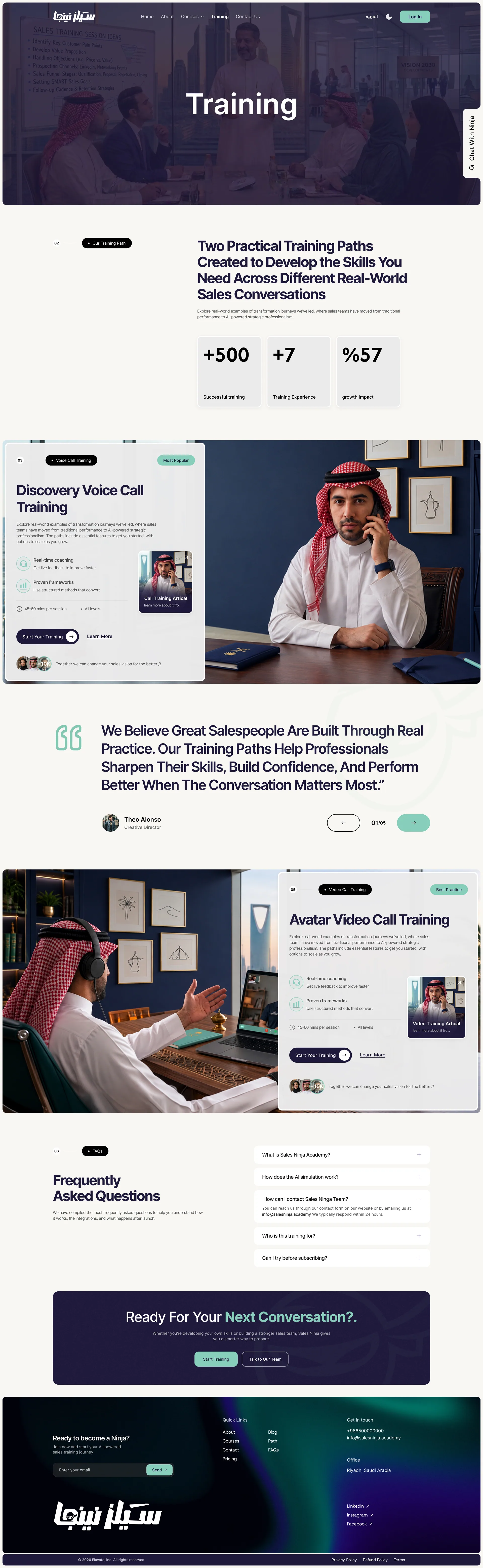
Key screens
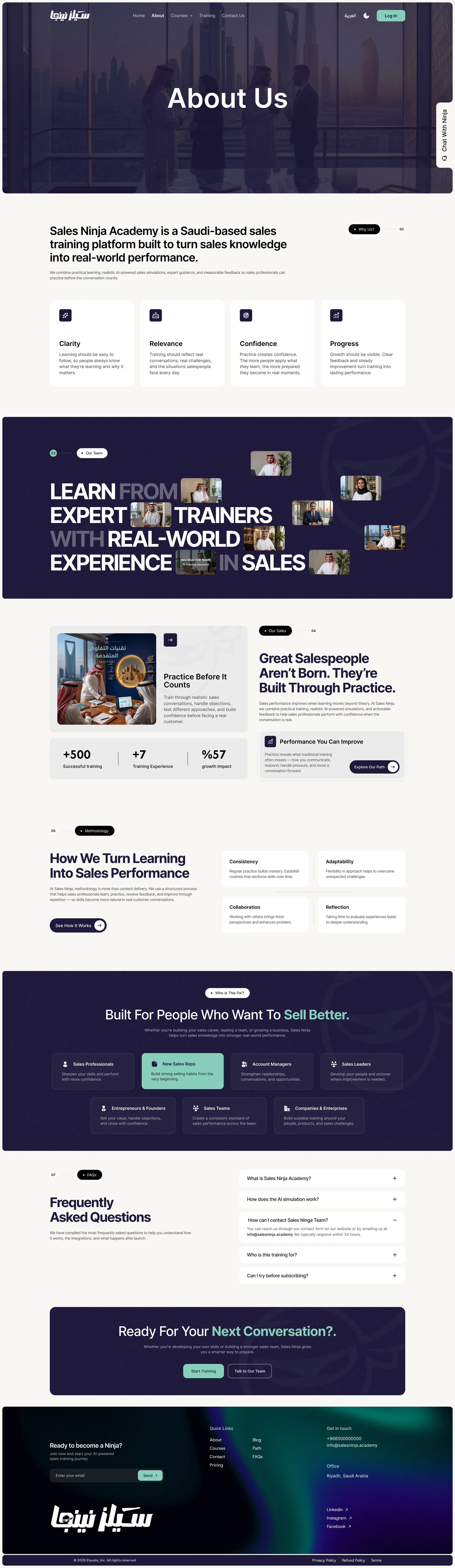
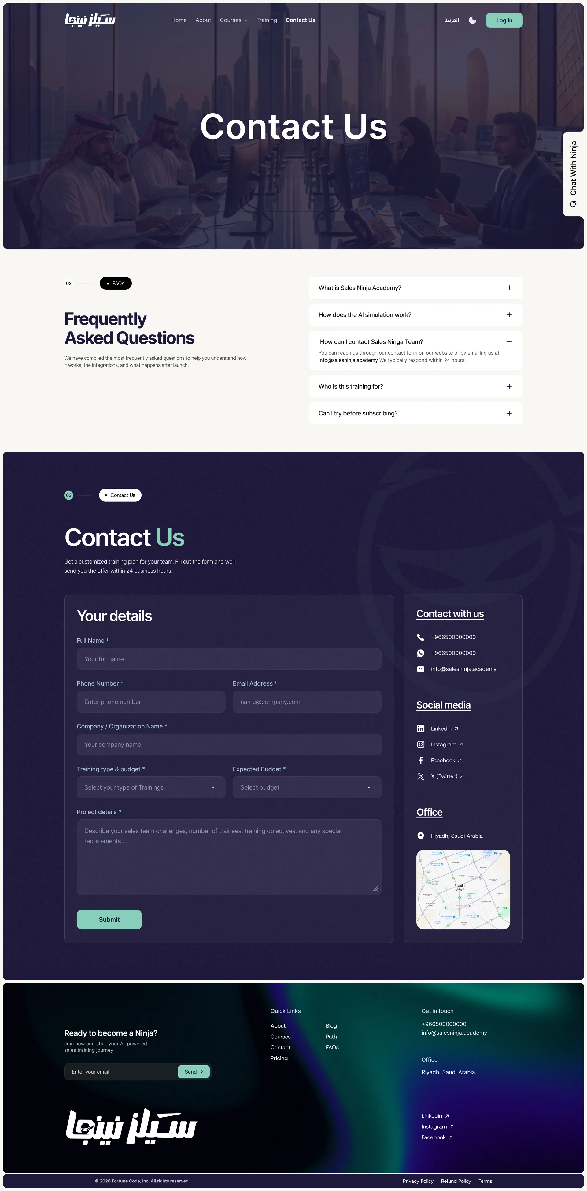
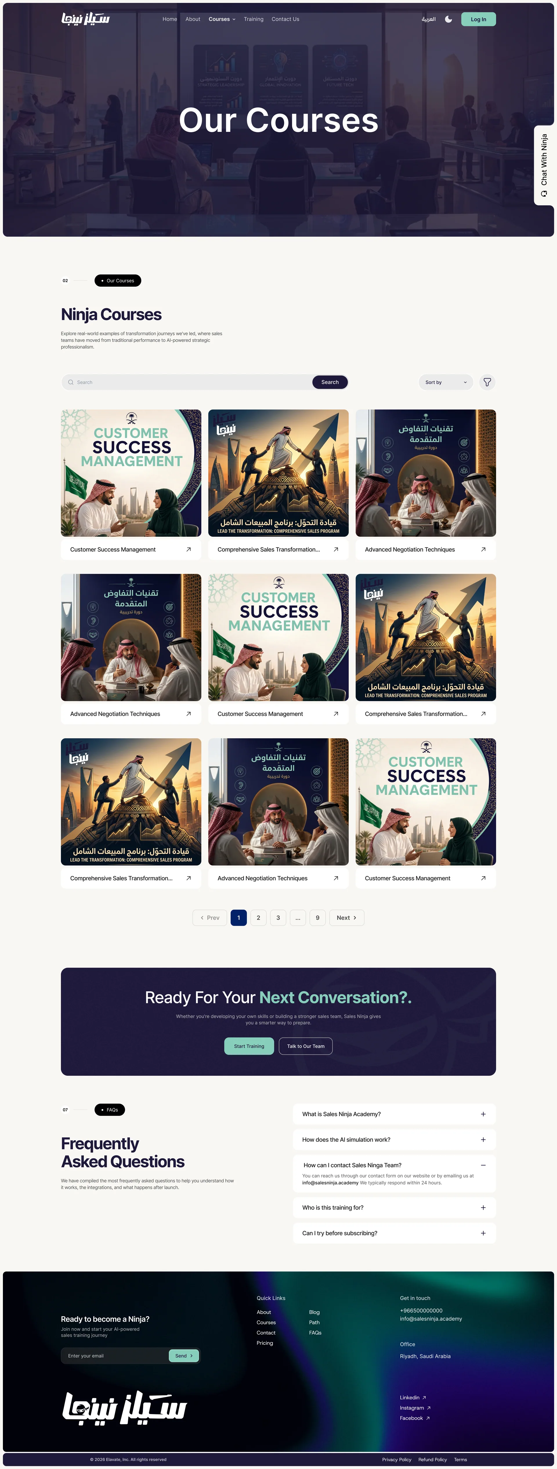
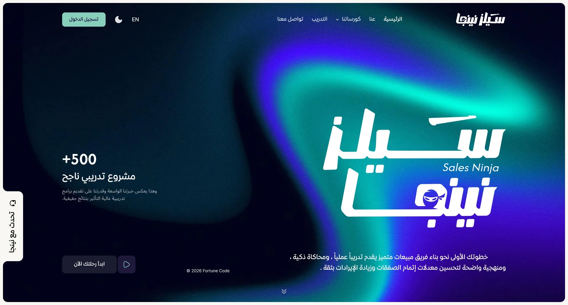
Design decisions
Built around the journey
The page follows the user's journey instead of being divided into a set of separate services.
Ninja as a visual language
We turned the ninja concept into a visual and interactive language, without letting the experience become an overdone, playful design.
Calls to action in context
Conversion points are repeated in context after each decision stage, instead of relying on a single call to action at the top of the page.
Information architecture
We reorganised the content into a journey that starts with the core value, then trust, training, tracks, results and packages, and ends with conversion.
Content hierarchy
We divided dense content into clear sections, strong headings and quick points, so users understand the product by scanning before they read in detail.
Interactive storytelling
We used motion and interaction to explain the value and add a sense of progress and exploration, instead of relying on long static pages.
Visual direction
- Aesthetic
- Bold, modern, tech-driven, dynamic, professional and interactive. A strong contrast between deep navy and pale teal, with bold typography, generous spacing and elements drawn from the ninja identity.
- Typefaces
- Inter for English, 29LT Kaff for Arabic
- Imagery
- Images and scenes from the world of sales, training and human interaction, supported by digital elements that reflect the role of AI. Compositions are clean and focus on the people or the main situation, with brand illustrations, abstract graphic shapes, custom icons and interactive UI elements.
- Motion
- Fast but measured movement that reflects the ninja personality and the energy of sales. Smooth transitions, reveal animations, hover states and micro-interactions direct attention and add a sense of progress without slowing the user down.
Under the hood
Technology
- Next.js 16
- React 19
- PostgreSQL
- Supabase
- Prisma
- Supabase Auth
- Tailwind CSS
- GSAP
- Framer Motion
- Python
- Vercel
Integrations
- Stripe
- Vapi
- LiveKit
- HeyGen LiveAvatar
- Deepgram
- Cartesia
- OpenRouter
- Nodemailer
- Cloudinary
- Supabase Storage
The technical challenge
The core of the product is a live, phone-style sales conversation with an AI buyer that speaks Saudi Arabic and has a face, and it only feels like real practice if the buyer replies quickly. The first version took about 4.5 seconds to answer in Arabic, so the call pipeline was rebuilt: speech providers were tested side by side to pick the best Arabic speech recognition, and the AI's voice is streamed straight into the avatar so its lips move while it speaks. Reply time dropped to about 2 to 2.5 seconds, and when a call ends the AI reviews the conversation against criteria set by the coach and gives a score out of 100, feedback on each skill, 3 strengths and 3 things to improve.
Performance and quality
The landing page's first response went from about 730 ms to about 170 ms because the page is now built ahead of time, and hosting the servers next to the database saved about 600 ms on each database round trip. 63 MB of images were removed, and images are served as AVIF or WebP. The platform covers 87 data models, 186 API endpoints and 169 pages, with role-based access and separate organisation spaces for companies, and it runs serverless so it scales with traffic.
What changed
A clearer offer
Sales Ninja's presentation is clearer about the core value of the platform and the role of AI in the training.
One experience, three audiences
The site speaks to individuals, sales teams and companies within one experience without losing clarity of content.
A connected user journey
The journey links discovering the platform, understanding the methodology and exploring the training, then taking action.
A unified visual identity
The visual identity is consistent across content, services, courses and packages within one coherent system.
Clear storytelling
The page tells one clear story, from the value of the platform to the methodology, the tracks and the next step.
Modern and conversion-focused
A modern experience designed to move the user from discovering the platform to starting training or contacting the team.
Strong visual hierarchy
A strong contrast between deep navy and pale teal, bold typography and generous spacing make the experience recognisable from the first screen.
What we delivered
- UX/UI design
- Responsive website for desktop, tablet and mobile
- Interactive landing experience
- Design system and reusable components
- Website development
Have a project like this one?
Tell us what you need and get a detailed quote within 24 hours: scope, cost and timeline.
Request a quote