Taj Holding
A bilingual corporate website for a Saudi investment group
Taj Holding is a Saudi investment group with a diversified portfolio across several strategic sectors. We designed and built its corporate website for investors, partners, stakeholders and decision-makers who need a clear view of the group's portfolio, leadership and market presence. The Taj team manages all of the content from a custom studio.
- Client
- Taj Holding
- Industry
- Investment and holding group
- Project type
- Corporate website
- Our role
- UX strategy, UI design, responsive design, visual direction and development
- Duration
- One month
The goal
Create a high-end corporate digital presence for Taj Holding that clearly communicates the group's scale, diversified portfolio, leadership and long-term vision. The site had to build confidence among investors, partners and key stakeholders.
The challenge
Taj Holding needed to present a diversified portfolio, its leadership, its history and its future vision in one digital experience without making the group feel fragmented or overly complex. Each sector needed enough visibility while staying connected under one corporate identity. The design had to move from simply presenting company information to a structured journey that builds institutional trust.
The solution
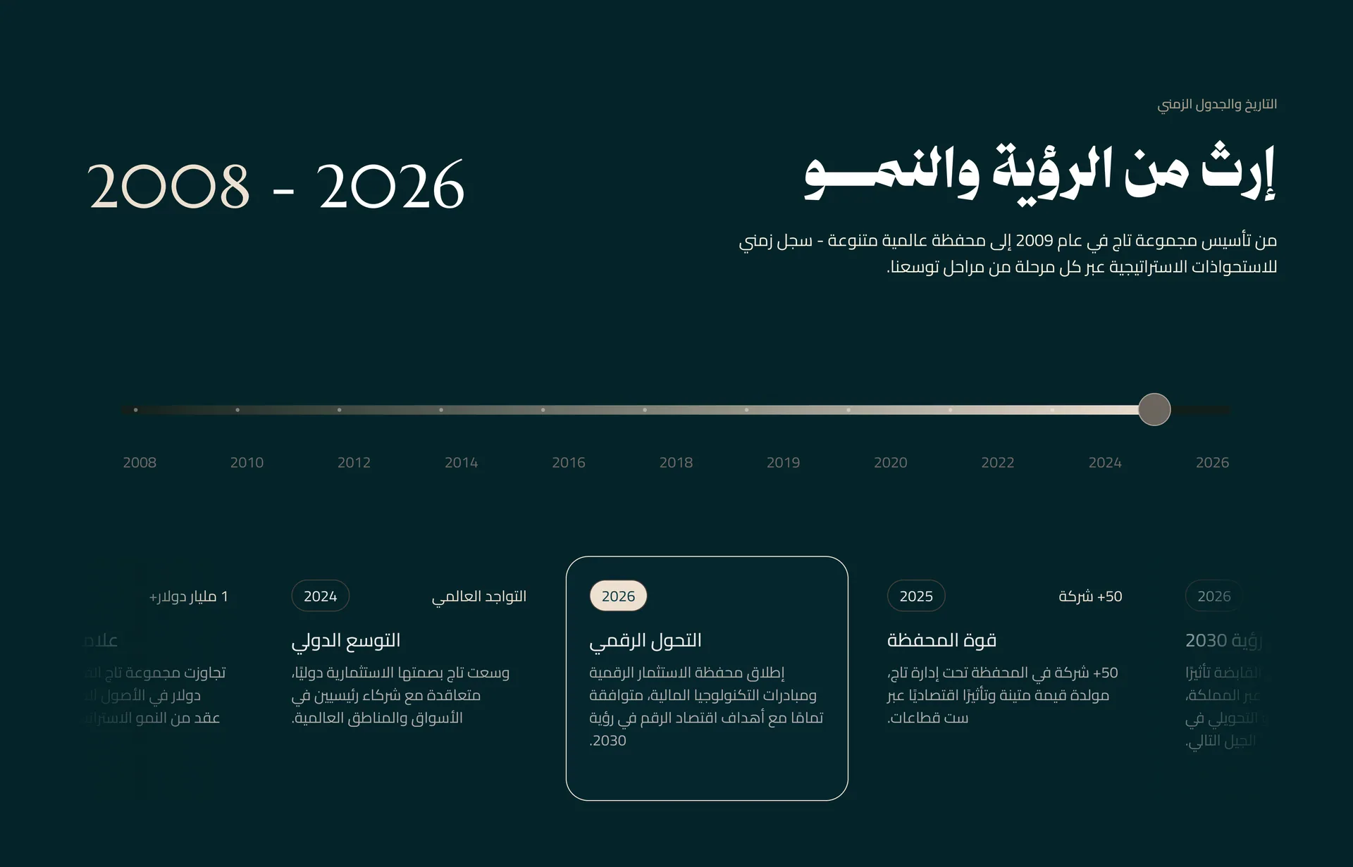
We created a clear corporate structure that brings Taj Holding's sectors, investments, leadership, milestones and media presence under one consistent visual and UX system. Visitors understand the group first, then explore its sectors, portfolio, milestones, media and contact points through a predictable hierarchy. A custom CMS studio lets the Taj team edit sectors, companies, news, the media kit, the board, the timeline, the map and the footer themselves.
How the work went
- 01
Corporate UX strategy
We structured the journey around understanding the group first, then exploring its sectors, portfolio, milestones, media and contact points.
- 02
Portfolio architecture
We organised the group's diversified sectors and investments under one clear system so the group feels connected.
- 03
Institutional visual direction
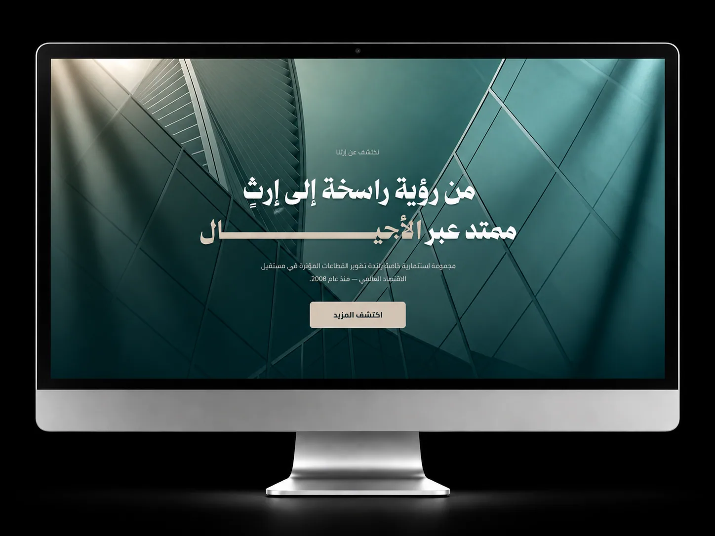
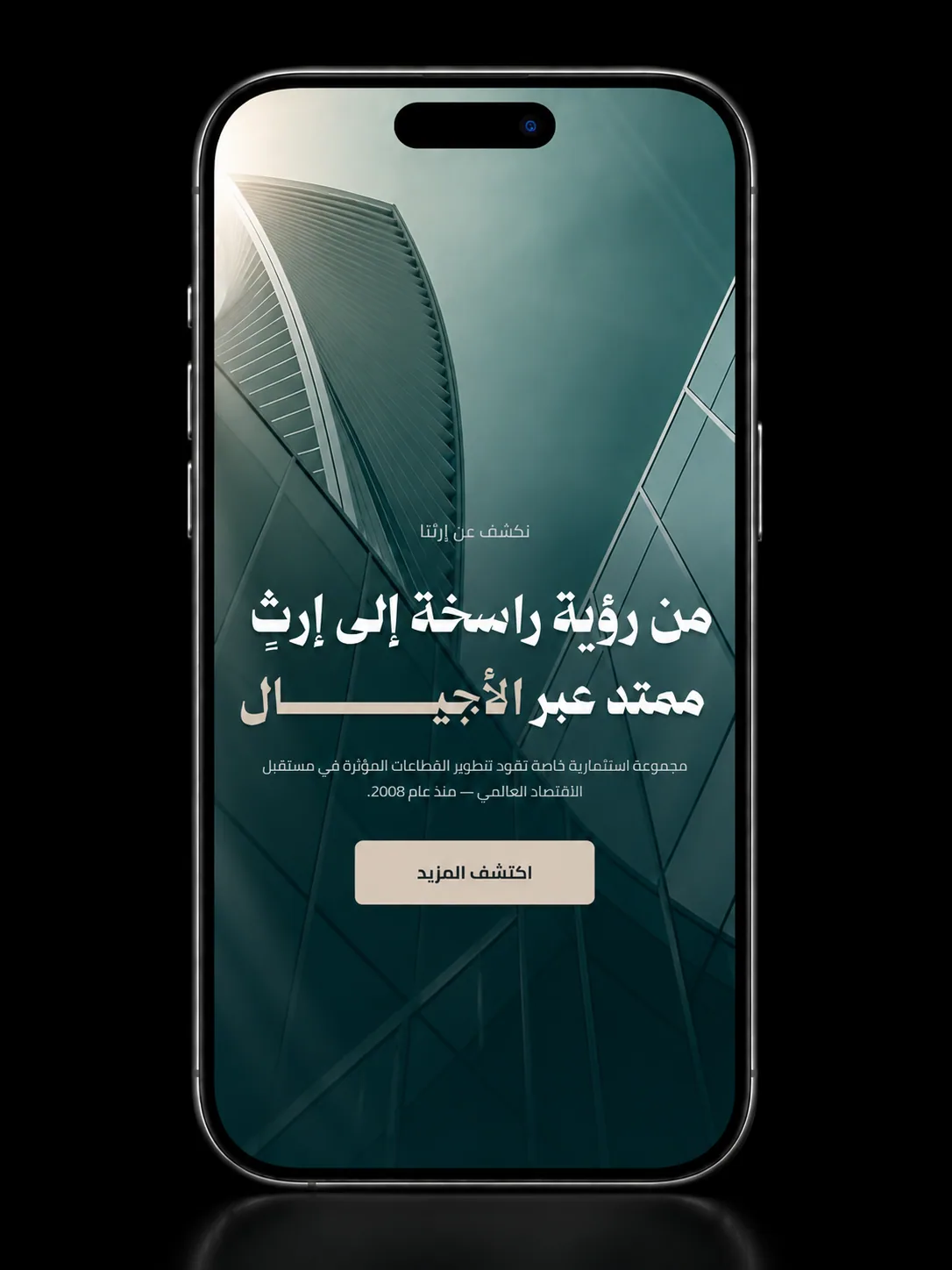
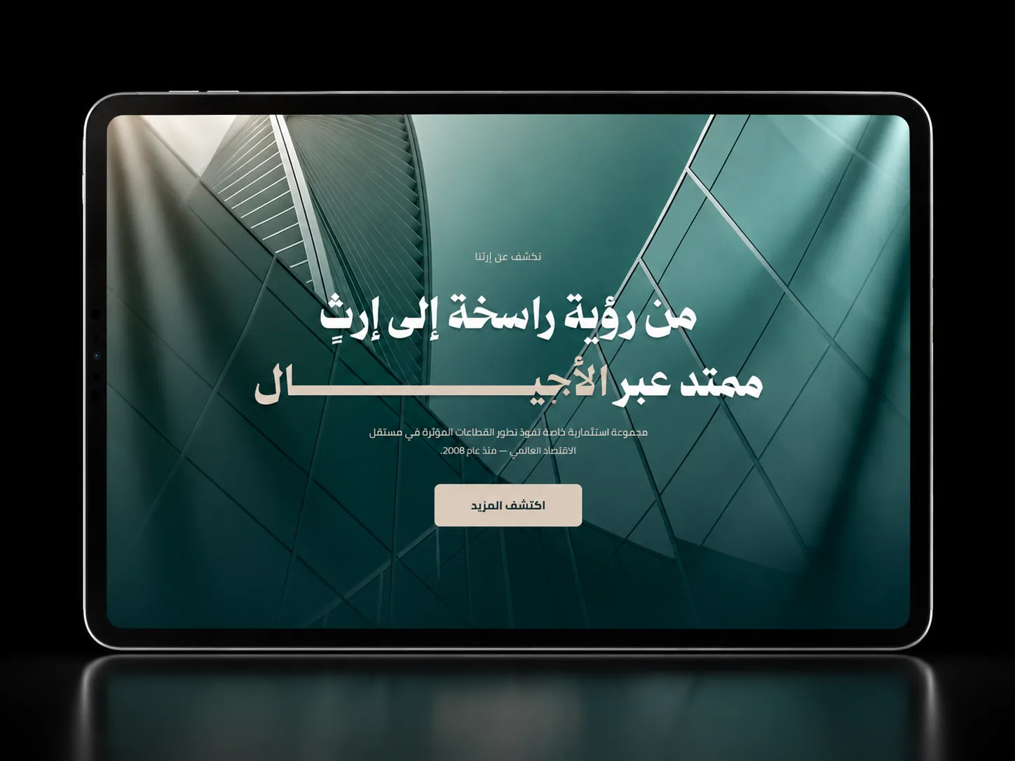
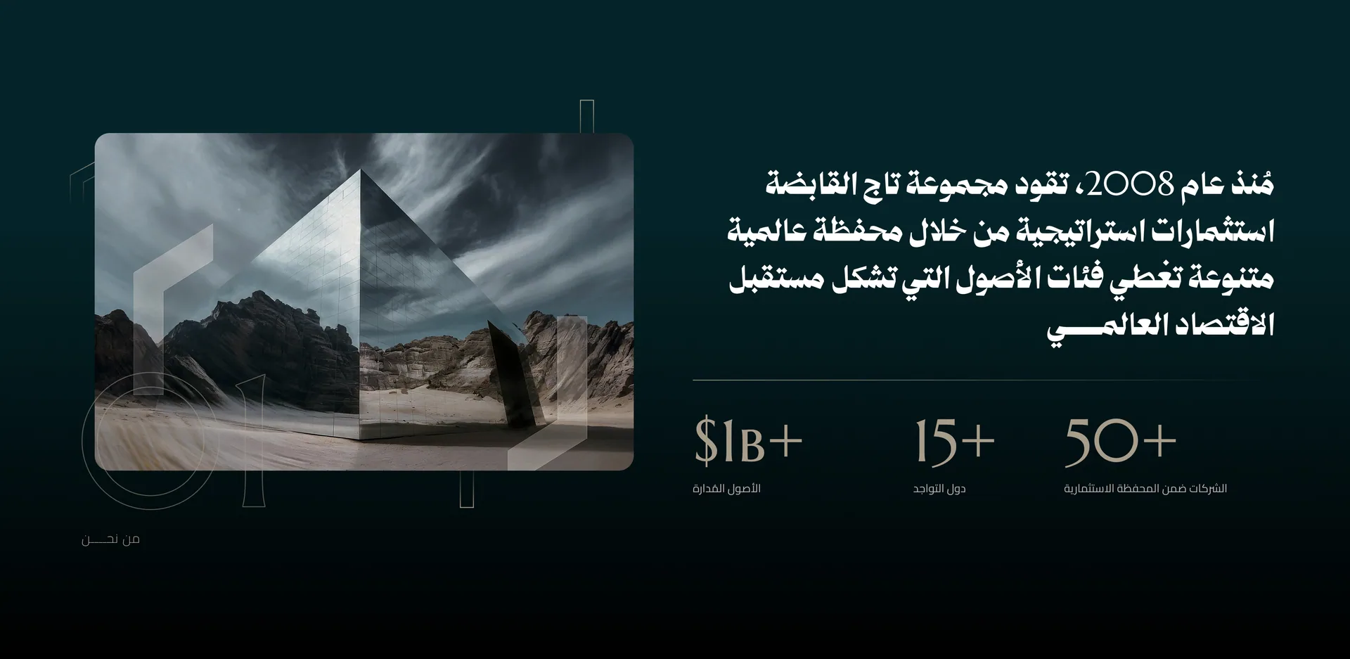
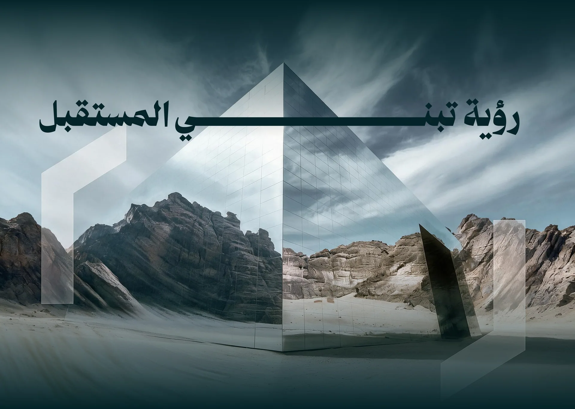
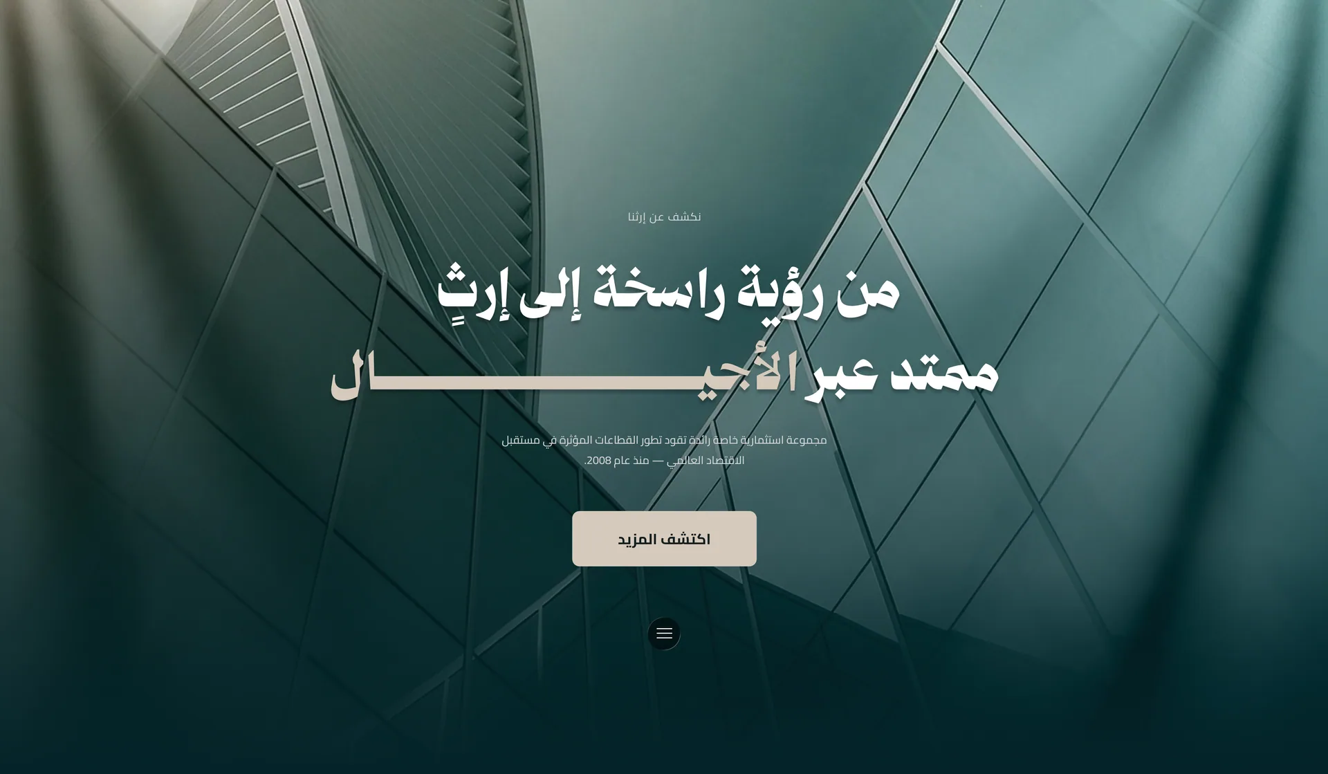
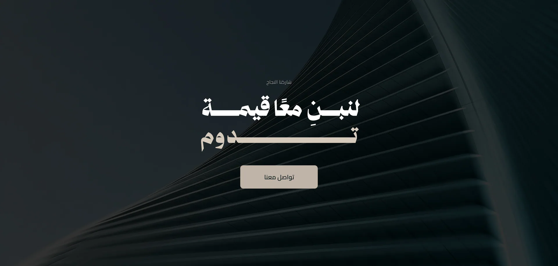
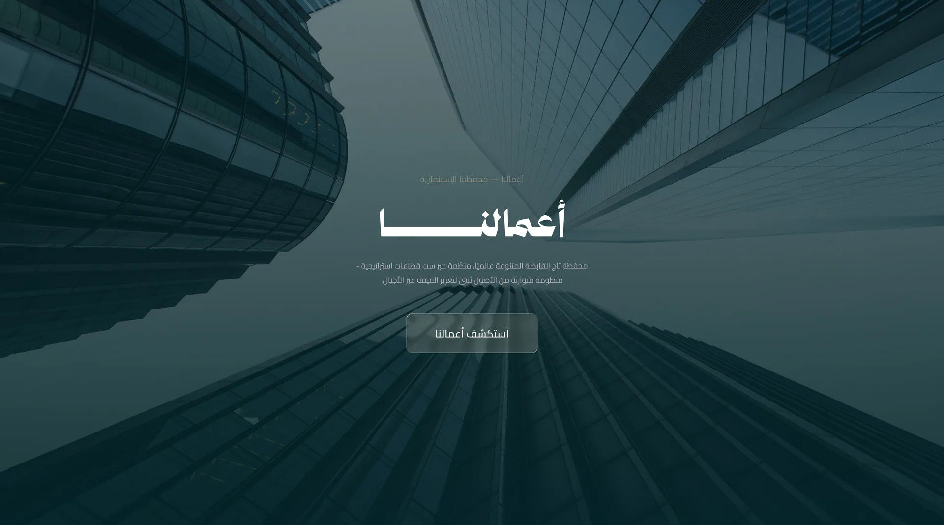
We built the direction around deep teal tones, warm neutrals, architectural imagery, strong typography and restrained layouts.
- 04
Responsive UI design
We adapted the interface across desktop, tablet and mobile while preserving hierarchy, readability and access to key corporate information.
- 05
Stakeholder-focused interaction design
Subtle scroll reveals, animated counters, timeline movement and refined hover states add depth while keeping the experience calm and professional.
Key screens
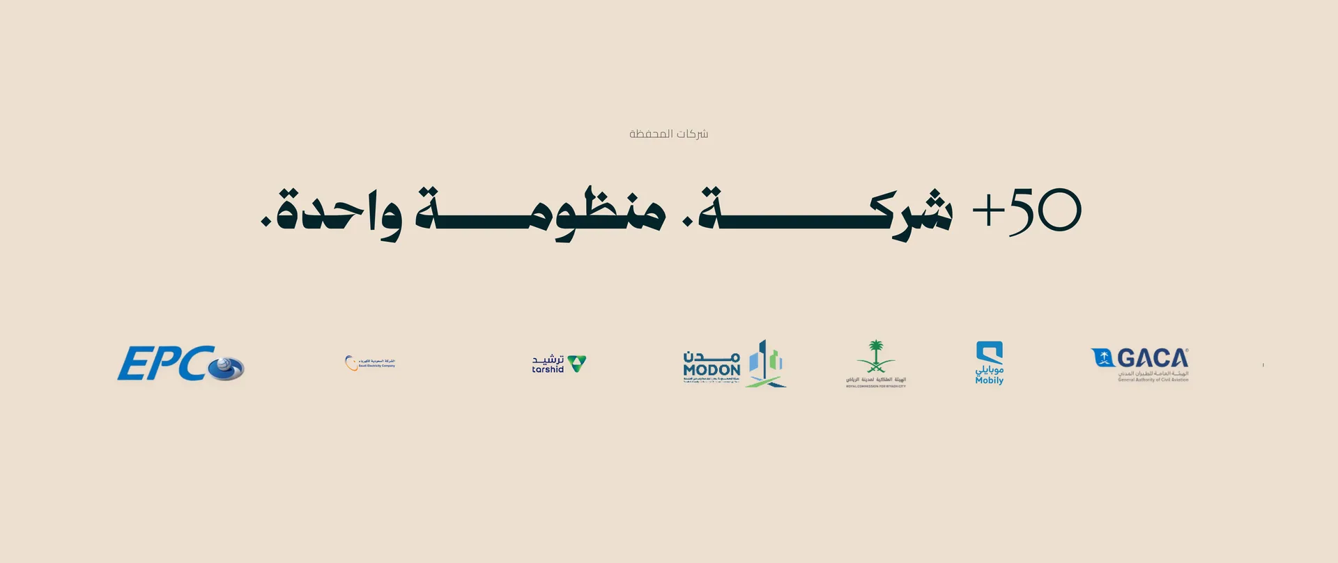
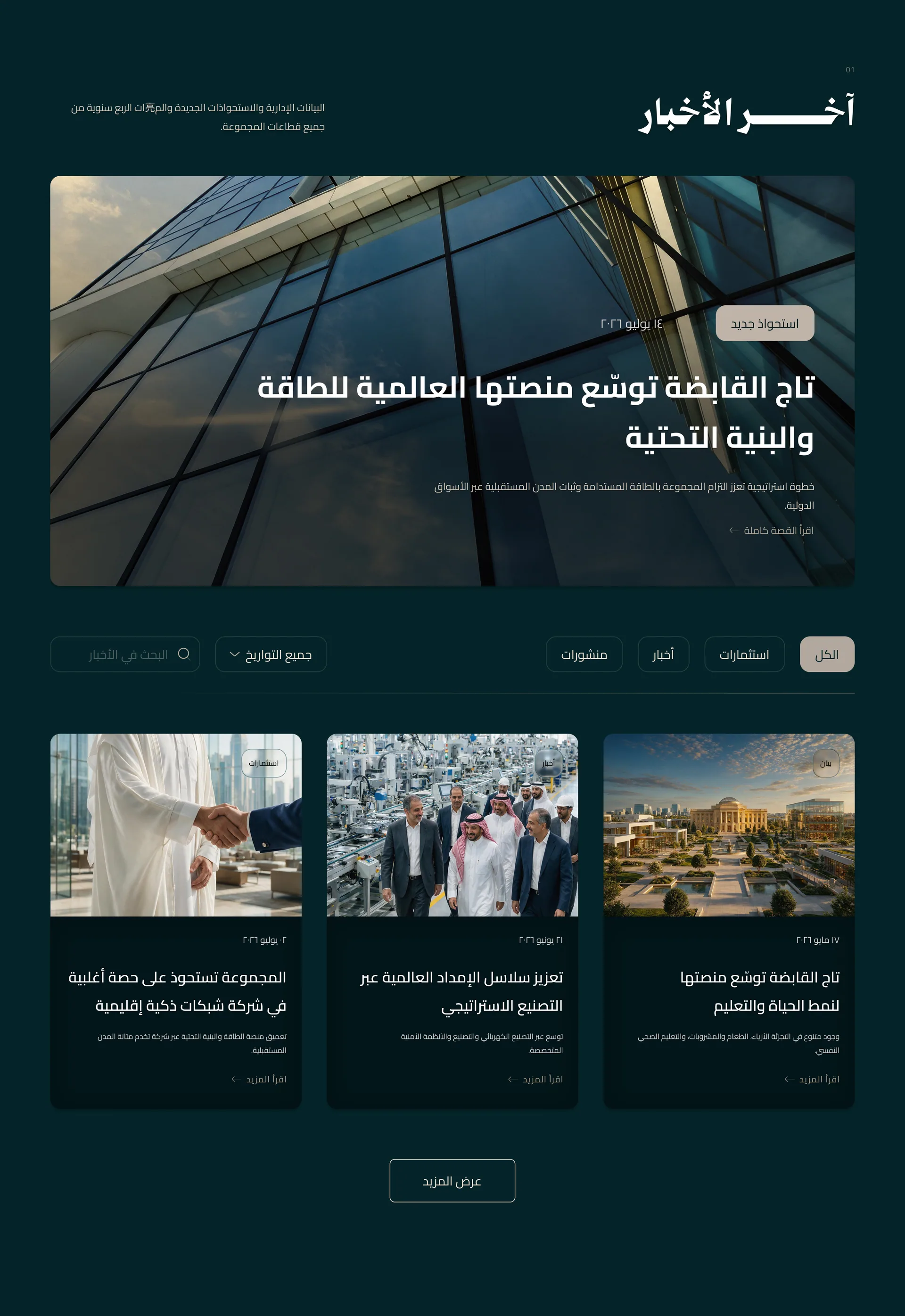
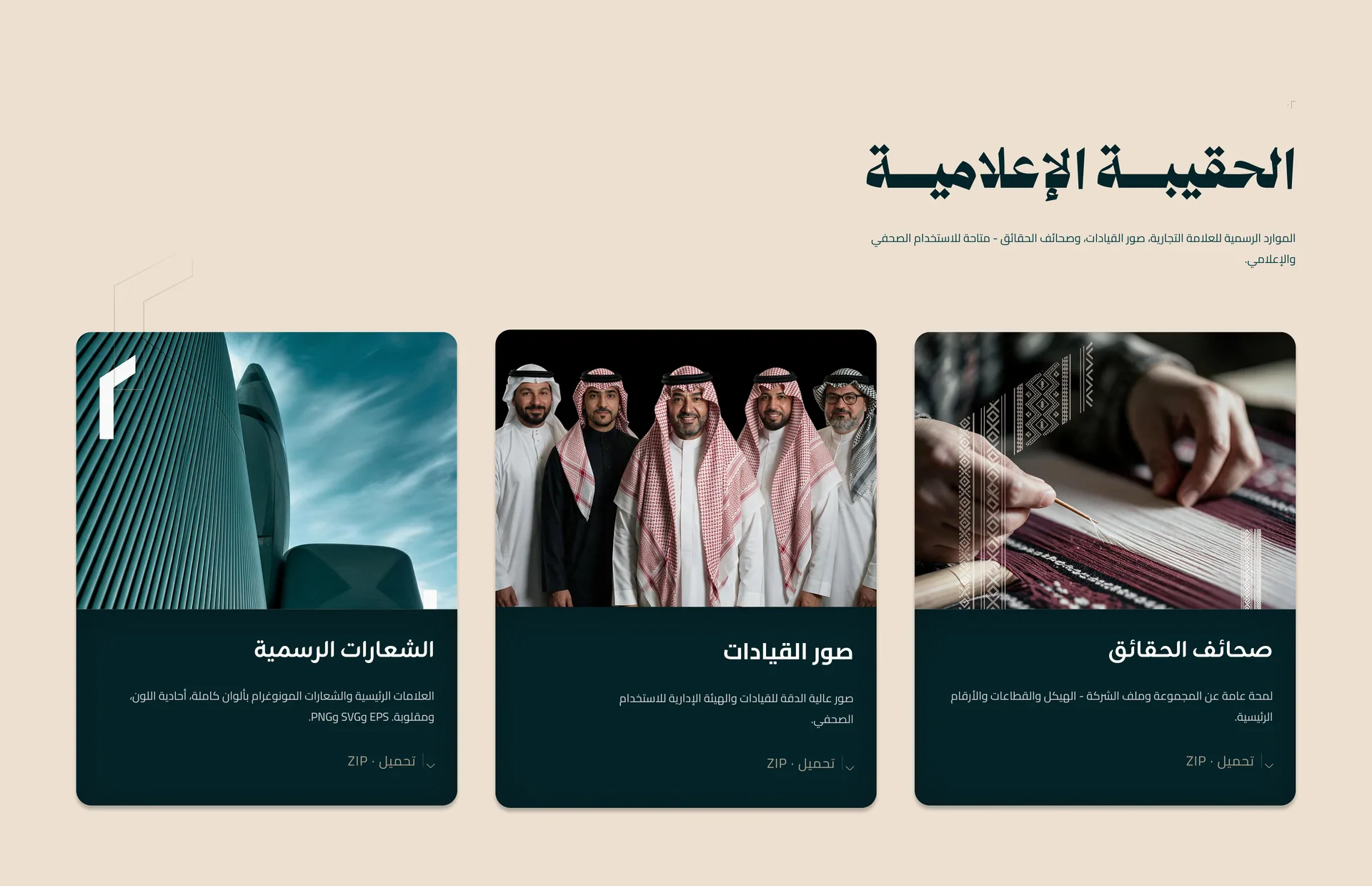
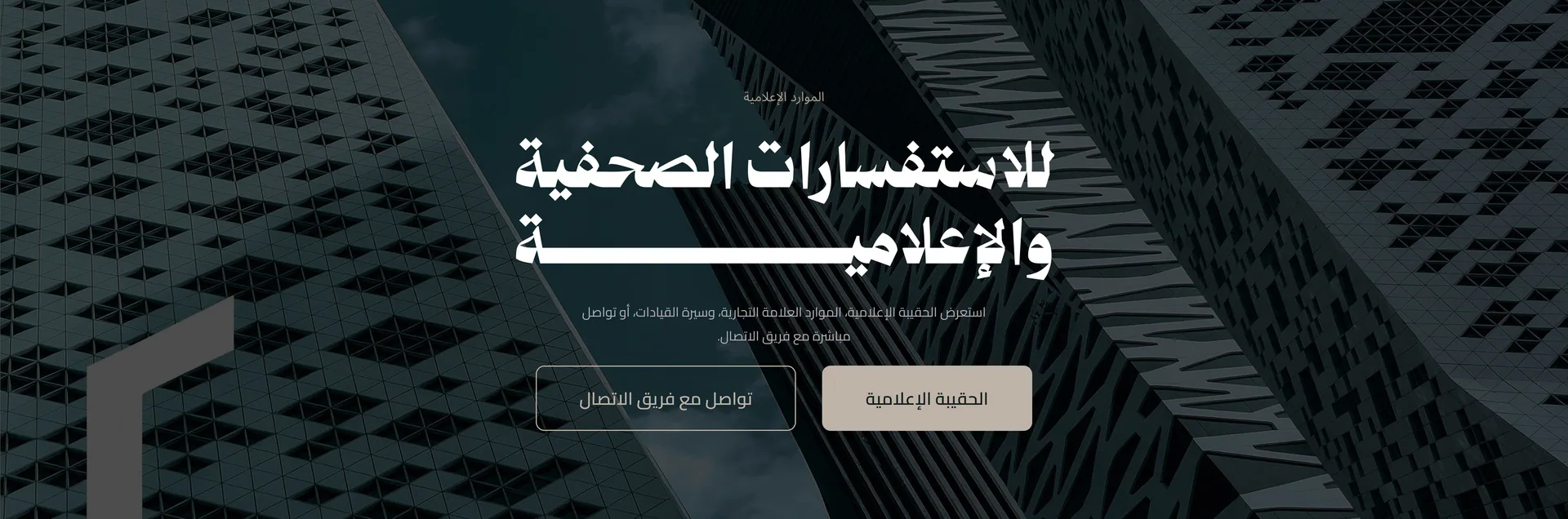
Design decisions
Unified portfolio structure
Taj Holding's diversified sectors and investments sit under one clear system, so the group feels connected rather than fragmented.
Institutional visual language
Deep teal tones, architectural imagery, strong typography and refined layouts communicate scale, stability and credibility.
Trust-led storytelling
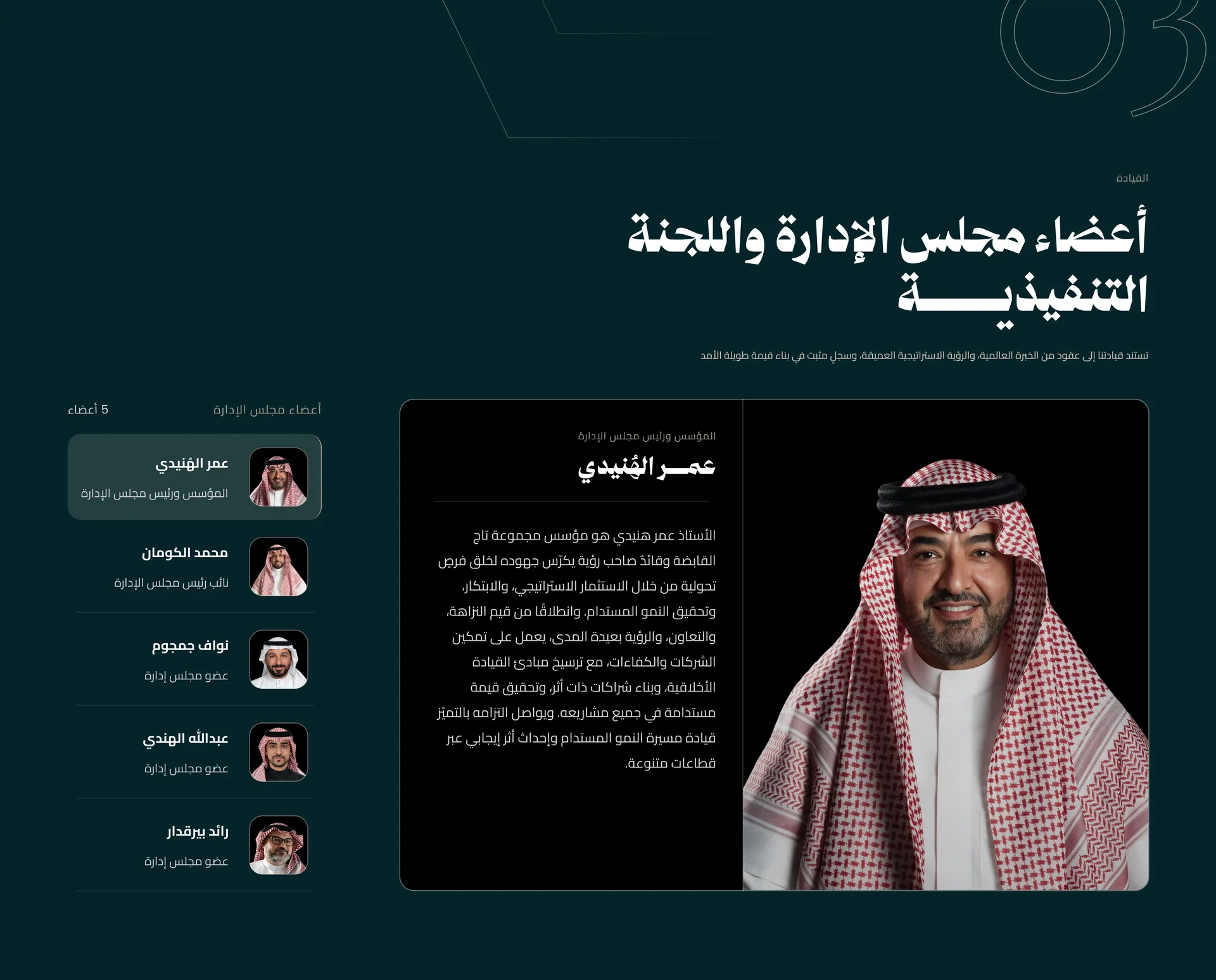
Leadership, milestones, numbers, partnerships and market presence receive greater emphasis to build confidence with investors and stakeholders.
One group, one clear system
We unified sectors, investments, leadership and corporate information under one consistent structure to make the group easier to understand.
Trust before complexity
We prioritised leadership, milestones, numbers, partnerships and presence to build institutional confidence before asking users to explore deeper content.
Clarity across every layer
Strong hierarchy, structured layouts and consistent visual patterns let users move between corporate, portfolio and media content without losing context.
Visual direction
- Aesthetic
- Clean, minimal and bold, with an architectural, institutional and refined character.
- Imagery
- Large-scale architecture, urban development, infrastructure, leadership portraits and institutional business imagery. The mood is confident, refined and cinematic, with controlled lighting, strong geometry, deep contrast and a sense of scale and permanence.
- Motion
- Smooth, restrained and confident: subtle scroll reveals, slow image movement, refined section transitions and controlled hover states. Animated counters, timeline transitions and map highlights support the story without overwhelming the user.
Under the hood
Technology
- Next.js 16
- React 19
- TypeScript
- Tailwind CSS 4
- shadcn/ui
- Radix UI
- Three.js
- React Three Fiber
- GSAP
- Lenis
- Swiper
- Supabase
- PostgreSQL
- Vercel
Integrations
- Supabase
- Google Maps
The technical challenge
The client wanted the home page logo to look like a physical object: brushed gunmetal with bevelled edges that catch a spotlight following the cursor. We rebuilt the 3D model directly from the official brand logo file, with real bevelled depth, and tuned the lighting until it matched the brand design. To keep the page fast, the 3D scene loads after the rest of the page, shadows are calculated once and heavy textures are not reloaded, so it runs smoothly on ordinary laptops and phones.
Performance and quality
Image weight across the site dropped by 48%, from 5.45 MB to 2.82 MB, with every image checked by measurement so quality did not drop. Content is served from a cache instead of querying the database on every visit, and one cached copy serves both languages. Studio permissions are checked on the server, and analytics use no cookies and store no IP addresses.
What changed
Clearer group structure
Taj Holding's sectors, investments, leadership and corporate content are organised into a more unified experience that is easier to understand.
Stronger institutional credibility
Milestones, leadership, partnerships, portfolio scale and market presence are more visible, which reinforces trust with investors and stakeholders.
Consistent cross-device experience
The interface works across desktop, tablet and mobile with the same hierarchy, visual identity and corporate tone.
Scalable digital foundation
The system gives a consistent framework for adding future sectors, investments, news, events and corporate content without disrupting the overall experience.
Clear corporate structure
Sectors, investments, leadership, milestones and media content follow one predictable hierarchy that makes the group easier to understand.
Strong institutional presence
A restrained visual direction and a real-time 3D metallic logo on the home page reinforce credibility and scale.
Trust-building content
Milestones, leadership, partnerships, portfolio scale and market presence are presented where investors and stakeholders see them first.
What we delivered
- Responsive corporate website UI
- Desktop, tablet and mobile screens
- Arabic and English interfaces
- Portfolio and sector pages
- Leadership and timeline sections
- Media centre experience
- Reusable UI components
- Visual design system
- Developer-ready handoff
Have a project like this one?
Tell us what you need and get a detailed quote within 24 hours: scope, cost and timeline.
Request a quote