Najran Health Cluster
A single digital portal for Najran Health Cluster services and information
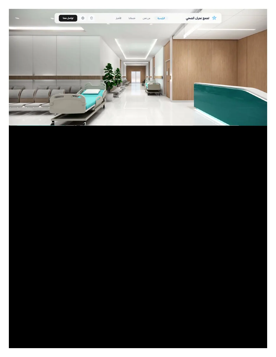
Najran Health Cluster is a large network of healthcare facilities and services, not a single medical facility. We designed and built its digital portal so that patients and the community can see what the cluster offers, reach the right service, follow news and contact the medical team from one place.
- Client
- Najran Health Cluster
- Industry
- Healthcare
- Project type
- Website
- Our role
- UX/UI design, full website development
- Duration
- Three months
The goal
To create a single digital portal that reflects the scale and role of the cluster and makes health services and information easier for patients and the community to reach. A large number of services, facilities, initiatives and content becomes one clear experience.
The challenge
The site speaks to many kinds of user: a patient booking an appointment, someone looking for a doctor, a user who needs a referral or the patient portal, a volunteer, an employee, a visitor asking about facilities and news. Many of them do not know the name of the body or service they need, only what they want to get done. The site also had to present the cluster's vision, the health transformation programme and the network's figures without getting in the way of someone who came to complete a direct task. All of this had to be organised without the site becoming a long government list that is hard to explore.
The solution
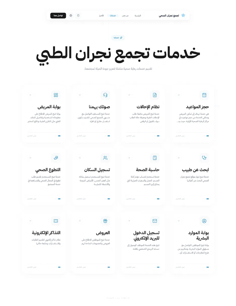
We organised the experience around what users need, not around the cluster's administrative structure. Services are presented as clear cards that can be scanned quickly, with separate sections for the cluster, its facilities, health transformation, statistics, news and contact. The visual language is light and reassuring, in white and blue with generous spacing. Direct contact and support points appear at the stages where a user may need help from a person.
How the work went
- 01
Service discovery experience
The information architecture is built around user tasks, not the cluster's departments. Users start with what they want to do and are led to the right service or information.
- 02
Responsive web design
Cards and content are redistributed on small screens by task priority. The service name, its description and the call to action stay clear, without secondary information crowding the screen.
- 03
Website development
We built the whole portal: the services directory, the sections about the cluster and its facilities, news and contact.
- 04
Content management integration
The site is connected to a content management system with its own admin entry, so the cluster's team can manage its digital presence.
- 05
Contact and patient support
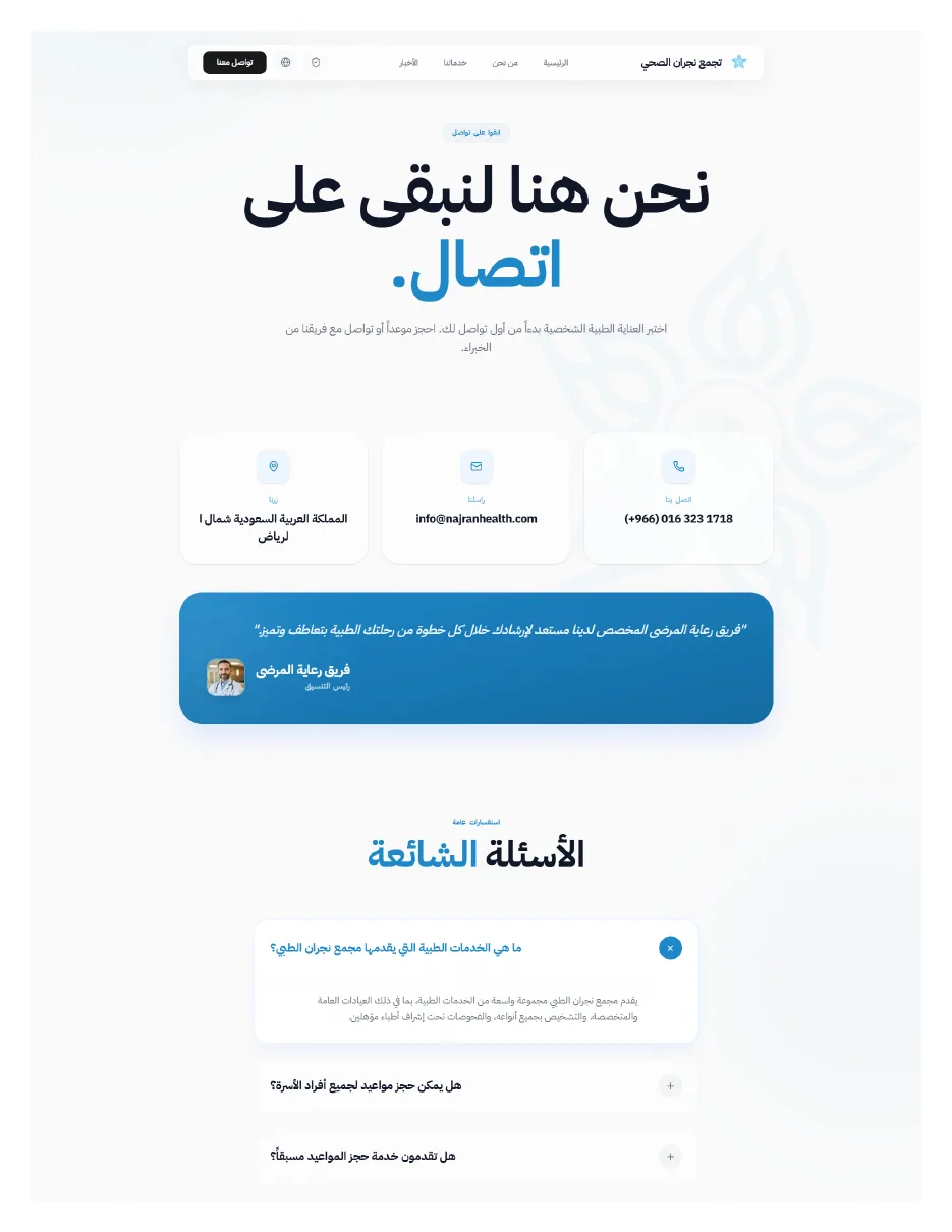
Contact and medical support channels are placed where they are easy to find, for the user who does not know the next step.
Key screens
Design decisions
Institutional and practical, separated
Institutional content is separated from practical services, while the journey stays one coherent whole.
Strong visual hierarchy
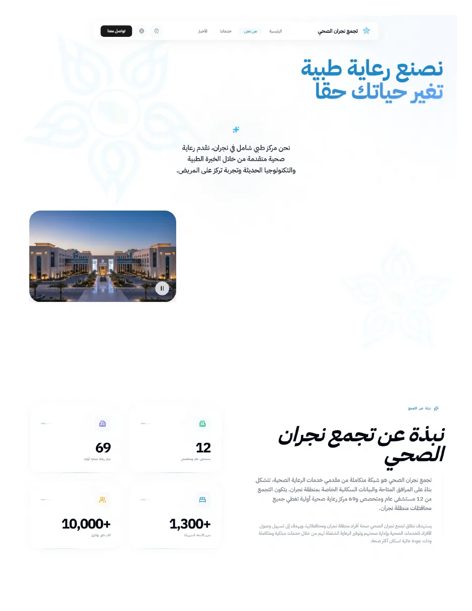
Figures, services and calls to action are given a strong visual hierarchy, because users differ in how much they already know.
A separate admin experience
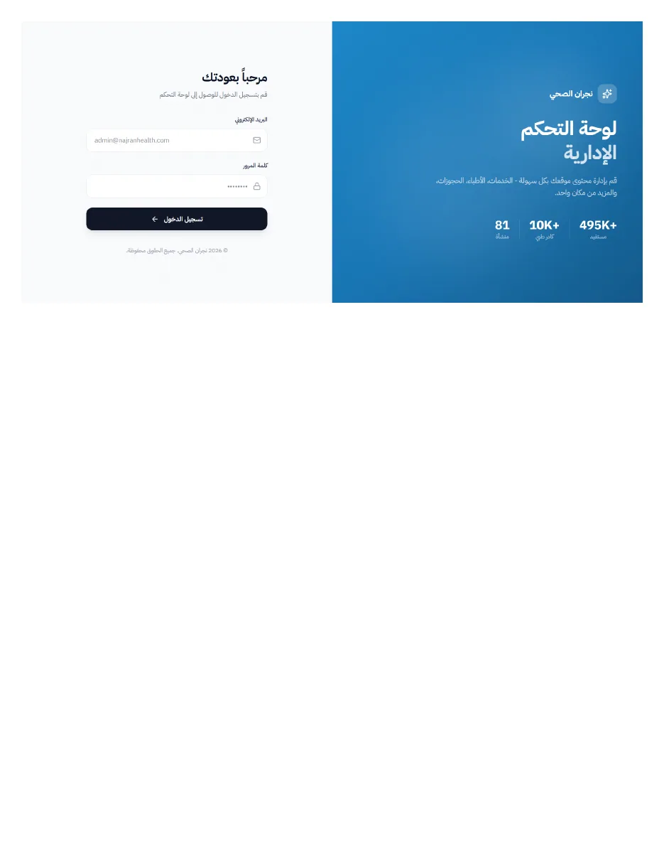
The admin experience is visually separate from the public one, while keeping the same identity.
User-centred service architecture
Services are organised around what the user wants to achieve, not the internal body responsible for it. Users need less knowledge of the administrative structure to reach a service.
Institutional storytelling
Pages and sections present the cluster's role, the health transformation programme, the facilities and the headline figures in a simple visual form. Users grasp the scale of the system without reading long reports.
Content and news experience
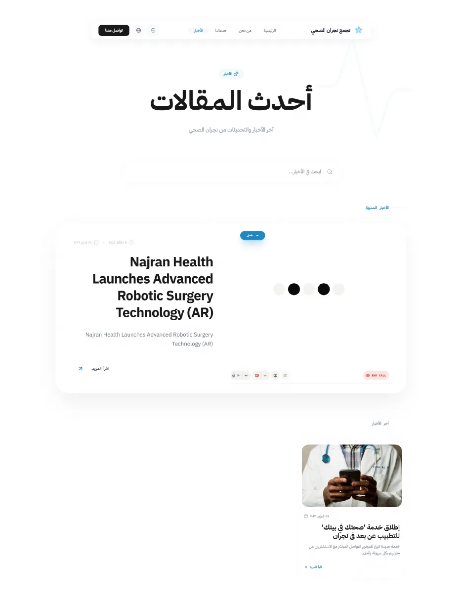
Awareness content and news are separated from operational services, with search and a clear article structure. Medical content can grow without affecting the service journey.
Visual direction
- Aesthetic
- Clean, trustworthy and human, with a modern clinical and institutional character. A high-clarity white and blue system with strong typography and consistent service cards.
- Typefaces
- Modern Arabic sans, with a bold Arabic display face for headings
- Imagery
- Real or realistic photographs of healthcare settings, facilities, doctors and patients, with clean, comfortable lighting and compositions that convey trust and medical progress. The imagery is human and professional, avoiding frightening or overly technical medical pictures.
- Motion
- Calm, reassuring movement: scroll reveals, light transitions and simple card interactions. Fast or showy motion is avoided, so the experience suits a healthcare setting and users of different ages and technical ability.
What changed
Services easier to explore
A large network of health services became a digital experience that is clearer and easier to explore.
One identity, one experience
Services, institutional content, news and support are brought together within one identity and one experience.
Less reliance on the structure
Users depend less on knowing the administrative structure to reach the right service.
Clearer contact channels
Contact and medical support channels are clearer for the user who does not know the next step.
Clear healthcare service discovery
Consistent service cards help users scan a large number of services quickly and reach what they need.
Patient-centred information architecture
Services are ordered by what the user wants to get done, not by the internal body responsible.
Large-scale content structure
Services, institutional content, news and support sit in one structure that can grow.
What we delivered
- Public healthcare website
- Healthcare services directory
- Appointment and service entry points
- About and institutional pages
- Admin login and CMS entry
Have a project like this one?
Tell us what you need and get a detailed quote within 24 hours: scope, cost and timeline.
Request a quote